Public schools making America smaller, Africa larger on new maps, allegedly to ‘fight white racism’
So now liberals want to change the maps in public schools so that they will be completely inaccurate because they are somehow racist. Let’s face it, liberals are some of the most racist people and race obsessed in the world.
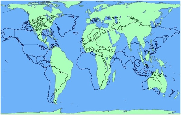
Boston public schools, among others, are discarding Mercator maps and replacing them with Peters maps. Mercator maps have been faulted for making America too large. The Peters map and others enlarge Africa.
It’s all about getting rid of – what else? – “white racism“!
The map exchange is part of the district’s effort to “decolonize the curriculum” within the next three years, said Colin Rose, assistant superintendent in charge of the Boston Public Schools’ Office of Opportunity and Achievement Gaps
What a title! This guy is in charge of “decolonizing” and “gaps.” What do you think his real job is? Get Whitey!
“So this is about maps, but it isn’t about maps,” Rose said. “It’s about a paradigm shift in our district. We’ve had a very fixed view that is very Eurocentric. How do we talk about other viewpoints? This is a great jump off point.”
Replacing the Mercator map was at the top of the list, he said, because the map “is, in my mind, one of the most insidious examples of how schools perpetuate racism.”
See? I told you it was all about getting Whitey. If you’re white and reading this:
1) First, slap yourself in the face for all the institutional racism you, or someone else who happened to be white you never knew, have made the world endure.
2) Apologize to the world for inflicting your “white maps” on it for centuries.
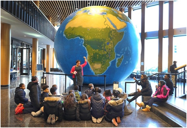
 This is one of the new educational tools. Drawn to scale, I am sure! Where did America go? I think you need to be on the balcony to see it!

It is claimed that the new “Peters” maps are more accurate than the old Mercator maps. Perhaps, perhaps not. What is admitted is that every map, by virtue of trying to accurately portray a globe on a flat surface, must have some inaccuracies, and it just so happens that the new maps make Africa taller while crushing northern Canada and Alaska into irrelevancy. The Boston school system doesn’t seem to mind these inaccuracies.
If the intent isn’t so much about accuracy, but rather about helping black children’s self-esteem, isn’t that itself racist?
Let me share a secret: black children are American first, not African. We are, or should all be, Americans first. Black children should be pleased to see America as the largest country because most if not all of them are Americans. To presume otherwise is racist.
But on the topic of size and maps, here are some other maps that I’ll bet children will not be seeing.
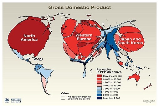
Look at this map that scales country size by GDP:

What happened to South America? It looks like Oprah on a diet!
Russia looks like a car crash!
And Africa, what happened to Africa? It’s been vaporized, except South Africa, which I guess you could call the “low hanging fruit”!
Now let’s look at countries based on how free they are:

What happened to Central America? Suddenly, America looks as though it has oceans on three sides!
And where is Asia? Mongolia looks like it’s floating in a big ocean.
And what happened to Africa? It looks as if someone “whited out” most of the continent!
But don’t expect children to learn from these maps. It might hurt their self-esteem and raise uncomfortable questions about whether all cultures really are equal.
